In the realm of interior design, color plays a pivotal role in shaping the ambiance and aesthetic appeal of a space. Among the myriad of color schemes available, the triadic color scheme stands out as a versatile and visually striking option. By leveraging the harmonious interplay of three distinct hues, this design approach offers endless possibilities for creating captivating interiors that exude balance and sophistication.
Understanding the Triadic Color Scheme
What is a Triadic Color Scheme?
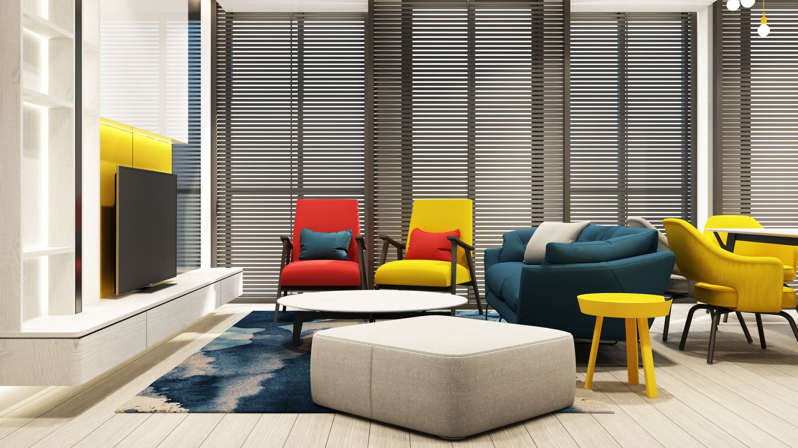
A triadic color scheme consists of three colors that are evenly spaced around the color wheel, forming a triangle. These colors are chosen in a way that they create a balanced and vibrant palette when used together in a design scheme. The key to successfully implementing a triadic color scheme lies in selecting colors that complement each other while providing enough contrast to prevent the space from feeling overwhelming.
Exploring Color Harmony
The beauty of the triadic color scheme lies in its ability to achieve harmony through contrast. By juxtaposing three distinct hues, designers can create visually dynamic interiors that capture attention and evoke a sense of cohesion. Whether it’s pairing warm tones with cool shades or combining primary colors with their secondary counterparts, the triadic color scheme offers endless opportunities for experimentation and creativity.
Applying Triadic Color Scheme in Room Design
Creating a Focal Point
One of the most effective ways to utilize a triadic color scheme in room design is by leveraging it to create a focal point. Whether it’s a feature wall, an accent piece of furniture, or a statement accessory, incorporating the three chosen colors in a prominent element draws the eye and adds visual interest to the space. By anchoring the design around these hues, designers can establish a cohesive color palette that ties the room together.
Balancing Contrast and Cohesion
Achieving the perfect balance between contrast and cohesion is essential when working with a triadic color scheme. While each color should stand out individually, they should also work harmoniously together to create a unified look. This can be achieved by varying the intensity and saturation of the chosen hues, as well as incorporating neutral tones to provide a sense of grounding. By striking the right balance, designers can ensure that the triadic color scheme enhances the overall aesthetic of the room without overwhelming the senses.
Embracing Versatility
One of the greatest strengths of the triadic color scheme is its versatility. Whether you’re designing a vibrant living room, a serene bedroom, or a sophisticate office space, this design approach can be adapte to suit any style or aesthetic preference. By experimenting with different combinations of colors and textures, designers can create unique and personalized interiors that reflect the personality and taste of the homeowner.
Conclusion
In conclusion, the triadic color scheme offers a powerful tool for creating visually stunning and harmonious interiors. By carefully selecting and combining three distinct hues, designers can unlock endless possibilities for creating dynamic and engaging spaces that leave a lasting impression. Whether you’re a seasoned professional or a novice enthusiast, embracing the triadic color scheme opens up a world of creative potential that is sure to elevate your room design to new heights.