- 1-overview-of-tips-for-choosing-the-right-paint-color-for-your-kitchen
- 2-criteria-for-selecting-paint-colors
- 3-key-paint-color-strategies
- 4-case-study-Improvement-recommendation
- 5-tips-for-paint-color-selection
Overview of Tips for Choosing the Right Paint Color for Your Kitchen
Renovating a kitchen involves more than selecting cabinets and countertops. The paint sets the tone, influences perceived space, and even affects mood. Understanding tips for choosing the right paint color for your kitchen empowers homeowners to create harmonious, inviting spaces. From cozy country cottages to sleek modern lofts, the ideal hue complements your style and daily routine.
1. The Psychology of Color
Colors evoke emotion: warm tones like soft yellows and peaches stimulate appetite and conversation, while cool blues and greens create a calm backdrop. Recognizing how paint shades interact with light and décor helps narrow choices from hundreds of swatches to a focused palette.
2. The Role of Natural and Artificial Light
North-facing kitchens often feel cooler, benefiting from warm paint to counteract bluish daylight. Conversely, sunlit south-facing spaces can handle deeper or more vibrant hues without feeling oppressive. Evaluating light at different times of day prevents surprises after the first coat dries.
Criteria for Selecting Paint Colors
1. Existing Fixtures and Finishes
Countertops, backsplash tile, and hardware finishes anchor the palette. A marble countertop with gray veining pairs beautifully with muted grays or off-whites, while brass accents pop against navy or forest green walls.
– Undertone Matching
Identify whether your fixtures have warm (golden, red) or cool (silver, blue) undertones. Paint with complementary undertones prevents clashing and fosters unity.
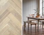
2. Kitchen Size and Layout
Small kitchens benefit from lighter paint to maximize the sense of openness. In larger, open-plan areas, accent walls or islands painted in bold hues draw the eye and delineate zones.
3. Color Finish Selection
High-gloss finishes reflect light and are easy to clean, ideal for high-traffic walls near stoves. Eggshell or satin deliver a soft sheen that hides minor imperfections in older walls.
Key Paint Color Strategies
1. Monochromatic Schemes
Using variations of a single color—such as pale sage on walls with deeper olive cabinets—creates a cohesive, serene environment. Layering tones ensures depth without overwhelming.
2. Contrast and Accent
Pairing neutral walls with a statement island or cabinetry in charcoal, teal, or mustard injects personality. This approach lets you experiment boldly while keeping the overall space balanced.
3. Trend–Informed vs. Timeless Choices
While trendy coral or millennial pink can refresh a kitchen, consider your long-term plans. If resale is near, timeless neutrals or soft pastels may yield broader appeal and longevity.
Case Study: Improvement Recommendation
When the Rodriguez family in Austin struggled to choose between gray-blue and creamy white, they consulted Improvement. Their design experts provided virtual mock-ups showing how each hue responded to the kitchen’s morning and evening light. After sampling peel-and-stick swatches on the backsplash, they selected a warm dove gray that highlighted their white marble counters and brushed-nickel fixtures. Improvement supplied premium paint and coordinating accessories, streamlining the entire process.
Why Trust Improvement
– Personalized Consultations
Improvement’s specialists analyze your lighting, finishes, and lifestyle to recommend a palette tailored to your home.
– Sample Kits and Virtual Tools
By providing real-paint sample pots and digital renderings, Improvement ensures confidence before committing to gallons of paint.
Tips for Paint Color Selection
1. Test Multiple Swatches
Paint 12×12-inch patches in each corner and view them throughout the day. Lighting shifts can dramatically alter perception, especially in north- or east-facing windows.
2. Limit Your Palette
Stick to three main colors: wall, trim, and accent. This constraint simplifies decisions and prevents visual clutter.
3. Consider Seasonal Decor
Neutral walls adapt to seasonal accessories—bright summer textiles or cozy winter rugs—without clashing.
4. Factor in Maintenance
Dirt and splashes are inevitable. Mid-tone hues in eggshell finish camouflage marks better than stark white or deep matte shades.